
Your site looks fine on a desktop. On a phone, the text is microscopic and the buttons are impossible to tap. That gap is what mobile optimization closes — and this guide gives you the full checklist to fix it.
What Mobile Optimization Actually Means
Mobile optimization is the process of ensuring a website loads fast, reads clearly, and works correctly on smartphones and tablets. It covers three layers: visual layout (responsive design), performance (load times, Core Web Vitals), and usability (touch targets, font sizes, navigation). A site can pass a “mobile-friendly” test and still score poorly on all three.
The distinction matters because Google uses mobile-first indexing — it ranks your site based on what Googlebot sees on a mobile crawler, not a desktop one. If your mobile version is thin or broken, your rankings suffer even for desktop searchers.
The Mobile Optimization Checklist
Work through these in order — viewport first, performance last. Each row maps to a concrete implementation task.
| Area | What to Check | Target |
|---|---|---|
| Viewport meta tag | Present in <head> on every page |
Required — see code below |
| Images | Served in WebP/AVIF, sized with max-width: 100% |
No layout overflow on 320 px viewports |
| Font size | Base body font ≥ 16 px | No “tap to zoom” needed to read |
| Touch targets | Buttons and links: 24×24 px minimum (WCAG 2.5.8 AA); 44×44 px recommended (WCAG 2.5.5 AAA / Apple HIG) | WCAG 2.5.8 (AA) minimum; 2.5.5 (AAA) and Apple HIG recommend 44×44 px |
| Horizontal scroll | No element wider than the viewport | Zero scrollbar at any width ≥ 320 px |
| Navigation | Hamburger or simplified menu on small screens | Reachable with one thumb |
| Interstitials | No full-screen pop-ups that block content | Google penalises intrusive interstitials |
The Viewport Meta Tag (Start Here)
Without this line in your <head>, mobile browsers render your page as a shrunken desktop layout at ~980 px, then the user must pinch-zoom to read anything. It is the single most common omission on sites that “look broken on phone.”
<!-- Paste this inside <head> on every HTML page -->
<meta name="viewport" content="width=device-width, initial-scale=1">
width=device-width tells the browser to match the screen’s actual pixel width. initial-scale=1 prevents zoom-in on load. That is all you need. Do not add user-scalable=no — it blocks accessibility zoom and MDN documents it as a usability failure.
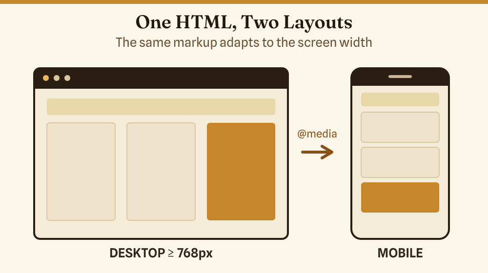
Responsive CSS: The Media Query Pattern
A responsive layout uses @media rules to change styles at breakpoints. The pattern below is a practical starting point: full-width single column on phones, two-column grid at 768 px and above.
/* Default: single column (mobile-first) */
.content-grid {
  display: grid;
  grid-template-columns: 1fr;
  gap: 1.5rem;
  padding: 1rem;
}

/* Two columns from 768 px upward */
@media (min-width: 768px) {
  .content-grid {
    grid-template-columns: 1fr 1fr;
    padding: 2rem;
  }
}

/* Clamp font size: min 1rem, max 1.25rem, fluid between */
body {
  font-size: clamp(1rem, 2.5vw, 1.25rem);
  line-height: 1.6;
}
Write CSS mobile-first (base styles target small screens, min-width queries add complexity for larger ones). It is easier to add features than to override them, and it keeps the critical-path CSS smaller for mobile users.
Core Web Vitals on Mobile
Google’s Core Web Vitals are the three performance signals that directly influence ranking. Mobile scores are measured separately from desktop — and mobile almost always scores lower because of slower networks and CPUs.
| Metric | What It Measures | Good Threshold | Poor Threshold |
|---|---|---|---|
| LCP (Largest Contentful Paint) | Time for the main content element to render | ≤ 2.5 s | > 4.0 s |
| INP (Interaction to Next Paint) | Delay from tap/click to visible response | ≤ 200 ms | > 500 ms |
| CLS (Cumulative Layout Shift) | Sum of unexpected layout shifts while loading | ≤ 0.1 | > 0.25 |
The fastest wins on mobile: compress images (WebP saves 25–35 % over JPEG), set explicit width and height on <img> to prevent CLS, and defer non-critical JavaScript. Check your scores free at PageSpeed Insights — it separates mobile and desktop results.
Images That Do Not Break Mobile Layouts
Two CSS rules handle 90 % of image overflow problems:
img {
  max-width: 100%;
  height: auto;
  display: block;
}
max-width: 100% ensures the image shrinks to fit its container. height: auto preserves the aspect ratio so it does not distort. display: block removes the default inline gap underneath images.
For performance, use the srcset attribute to serve smaller files to smaller screens:
<img
  src="hero-800.webp"
  srcset="hero-400.webp 400w, hero-800.webp 800w, hero-1200.webp 1200w"
  sizes="(max-width: 600px) 100vw, 50vw"
  alt="Responsive hero image"
  width="800"
  height="450"
>
The width and height attributes are not cosmetic here — they let the browser reserve space before the image loads, eliminating layout shift (CLS).
Touch Targets: The Size Rule
The average adult fingertip covers roughly 44–57 px on a screen. WCAG 2.5.8 (Level AA) sets a minimum of 24×24 px for tap targets, while WCAG 2.5.5 (Level AAA) and Apple’s Human Interface Guidelines both recommend 44×44 px for comfortable use. In practice, targeting 44×44 px avoids mis-taps and the need to zoom. When I first built sites without this in mind, I got user complaints about “impossible buttons” on my own contact forms — and a tap-target audit flagged every navigation link.
- Set
min-height: 44pxandmin-width: 44pxon<button>and<a>elements used for navigation. - Add
paddingrather than increasing the visible size — the tap area grows without changing the visual design. - Space adjacent links at least 8 px apart to avoid mis-taps on neighbouring targets.
- Avoid placing interactive elements in the bottom corners of the screen where navigation gestures on iOS and Android interfere.
How to Test Mobile Optimization
Testing on a real device catches problems emulators miss. Use at least one actual Android and one iOS device before launch. Supplement with these tools:
- PageSpeed Insights — Core Web Vitals field data plus diagnostics, separate mobile tab.
- Google Mobile-Friendly Test — checks viewport, font size, tap targets, content width. Gives a pass/fail plus a screenshot of what Googlebot sees.
- Browser DevTools responsive mode — in Chrome or Firefox, press F12, toggle device toolbar (Ctrl+Shift+M), select a device preset or enter custom dimensions. Test at 320 px (small Android), 375 px (iPhone SE), and 430 px (iPhone Pro Max).
- mobiReady — independent W3C-based mobile-readiness report.
Common Mobile Optimization Mistakes
- Missing viewport tag — the page renders at 980 px on every phone. Fix: add the meta tag shown above.
- Fixed-width containers — a
divset towidth: 960pxoverflows on any phone. Fix: usemax-widthwithwidth: 100%. - Uncompressed images — a 3 MB hero image that looks fine at 50 Mbps home broadband is a 12-second wait on 4G. Fix: compress and use
srcset. - JavaScript that blocks rendering — scripts in
<head>withoutdeferorasyncdelay the first paint. Fix: adddeferto non-critical scripts. - Pop-ups that cover content immediately — Google documents a ranking penalty for intrusive interstitials on mobile.
Mobile Optimization for Site Builders vs. Custom Code
If you are using a site builder (WordPress, Squarespace, Wix), most layout problems are handled by the theme. Your jobs are: choose a theme with a documented mobile score above 90 on PageSpeed, test the actual pages (not the demo), and avoid third-party widgets that inject render-blocking scripts. See the guide to HTML widgets for websites for advice on embedding external widgets without hurting load time.
If you are writing your own HTML and CSS, the checklist above applies in full. Work mobile-first, test on real devices, and check Core Web Vitals after every major change.
The Basics Behind Responsive HTML
If you are new to HTML itself, it helps to understand the structural layer before tackling CSS responsiveness. The HTML basics guide covers the fundamentals — what tags do and how the browser reads your markup. Separately, the HTML file opener guide explains how to open and edit HTML files directly if you are working outside a CMS.
Frequently Asked Questions
What is the difference between responsive design and mobile-friendly?
Responsive design means the layout fluidly adapts to any screen width using CSS (flexible grids, images, and media queries). Mobile-friendly is a broader term — a site can be mobile-friendly by having large enough text and buttons without being fully responsive. Google’s mobile-first index rewards responsive design because it serves one URL for all devices, which simplifies crawling.
Does mobile optimization affect SEO?
Yes, directly. Google switched to mobile-first indexing in 2023, meaning it uses the mobile version of your page to determine rankings. A site with a broken mobile layout, slow load times, or intrusive interstitials can see ranking drops even if the desktop version is excellent.
What viewport meta tag should I use?
Use <meta name="viewport" content="width=device-width, initial-scale=1">. Avoid adding maximum-scale=1 or user-scalable=no — these block users from zooming for accessibility and are flagged as failures in mobile usability audits.
What is a good mobile page speed score?
Google’s PageSpeed Insights scores 0–100. A score of 90 or above is “Good.” Most sites scoring below 50 on mobile have uncompressed images or render-blocking scripts as the primary cause. Fix those two first before tuning anything else.
How do I check if my site passes Google’s mobile test?
Go to search.google.com/search-console/mobile-friendly, paste your URL, and run the test. It renders the page as Googlebot Mobile sees it and lists any specific failures.